How to Spot Reproduction Vintage Signs Before You Buy
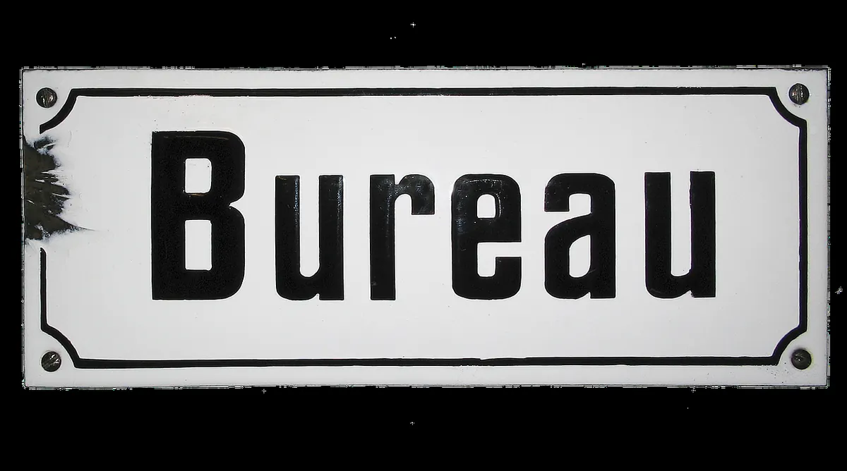
Reproduction signs have never been better made, and never easier to sell. A tin advert for Woodbines that left a factory in the 1930s should look and feel its age; one printed last year can be made convincing from three metres away and rather less so under a desk lamp. The difference matters, because the price gap between a genuine period sign and a decorated sheet of steel is usually enormous.
The good news is that fakes are lazy in predictable ways. Once you know where to look, most reproductions announce themselves within a minute.
Start With the Back of the Sign
Turn it over first. The reverse is the hardest part to fake convincingly, and dealers rarely bother trying.
An original sign has a back that tells a story. You might find patchy surface rust, a ghost outline of old paint or wallpaper where it hung against a wall, a mill finish that has dulled unevenly, and mounting holes punched from the front so the metal flares slightly on the reverse. Rivets and eyelets are usually corroded in place, often stained at the edges where water ran down.
A modern reproduction typically has a uniform grey, black or powder-coated back. The mounting holes are drilled cleanly and evenly, with no burr on either side, and the eyelets are bright or glued rather than set. If the back looks like it came out of a packaging warehouse, assume it did.
Read the Rust, Not the Colour
Real rust is corrosion: it eats into metal, lifts paint from below, and follows water. Look for it where moisture actually gathered rather than where it looks picturesque.
- The bottom edge, where rain ran down and pooled.
- Around mounting holes, where bare steel was exposed.
- Beneath the rim of enamel or paint, creeping outwards from a chip.
- The top edge, where a sign met a damp wall for decades.
The test is depth. Run a fingernail across a rust patch. Genuine corrosion has texture, pitting and a slightly raised, flaking crust; the paint around it usually lifts at the border. Painted-on rust sits flat on top of the surface like a stain. It is often a single shade of orange-brown applied with a sponge, and it appears in decorative places — a flourish in the middle of a panel — rather than in the dull, inconvenient places where weather actually works.
Fonts Date a Sign More Sharply Than Wear Does
Typography is a timeline. Futura arrived in the late 1920s, Helvetica in the late 1950s, Arial in the early 1980s. If a sign claiming to be Edwardian is set in something that did not exist until the space age, the sign is not Edwardian — however good the rust looks.
Then look at the finish of the lettering. Signwriters worked by hand and by eye. Letters vary very slightly in weight and spacing, a curve might sit a fraction low, and an ampersand will have a personality. Digitally recreated artwork is usually too even, too centred and too perfect. Curly apostrophes, en dashes and hairline serifs are typesetting habits rather than signwriting ones, and they turn up on reproductions far more often than on originals.
Finally, check the sense of the thing. Pre-decimal prices, old spellings, a brewery that closed decades ago, a phone number with no area code — all of these should be consistent with the date the seller is claiming. Reproductions often mix a genuine brand name with a period that does not fit it.
Printing Methods and the Loupe Test
A ten-times jeweller's loupe costs very little and settles most arguments.
Lithographed tin
Older tin signs were printed lithographically. Under magnification you see fine, slightly irregular stippling and soft edges where colours meet, because the ink was pressed onto metal from a stone or plate.
Screen printing
Modern screen-printed reproductions give themselves away with big flat blocks of colour, faint mesh texture, thick ink at the edges of letters and occasional squeegee streaks. Colours are usually cleaner and more saturated than anything from the 1930s.
Digital printing
Inkjet and digital presses leave a regular dot pattern — a rosette of tiny coloured dots — visible through the loupe, plus pixelation along the curves of large letters. Look at the edge of a big red letter: a genuine sign has a clean border, a digital print has a staircase.
Enamel, Tin and Other Materials
Genuine vitreous enamel is glass fused onto steel at high temperature. It is hard, cool and glossy, and it fails like glass: chips have sharp, glassy edges, often with a dark rim where the exposed steel has oxidised, and you may find hairline cracks radiating like ice. Reproductions are usually powder-coated, resin-coated or simply painted. They scratch with a fingernail, they chip with curled edges, and they feel warm and slightly soft compared with the real thing.
Weight and flex matter too. A period enamel sign of any size feels surprisingly heavy and rigid. Modern "tin" reproductions are thin, springy and light, and will bend if you press a corner.
Fake Ageing: Smell, Wear and Provenance
Wear follows use. Genuine signs are scuffed at the bottom edge, worn around the holes, stained where a bracket rubbed, and often grubby along one side only. Reproductions are aged all over: sandpapered edges, scuffs in the centre of a panel, a uniform tea or coffee wash, a smear of wax or shoe polish that has not quite dried into the surface.
Your nose helps here. Furniture polish, beeswax, coffee and solvent-based ink all smell recent and obvious. Old metal smells of dust, iron and damp.
Ask the seller where it came from and whether they will put their opinion in writing. A vague answer is not a problem in itself; an elaborate story attached to a suspiciously perfect sign usually is. Matched sets are worth noticing too — six identical signs with identical rust patterns were aged together, in a workshop.
Before You Hand Over Your Money
- Turn it over and inspect the back before anything else.
- Look at rust through a loupe; check whether it has depth or sits flat.
- Date the typeface and the language, and check they match the claimed era.
- Check printing method: litho stipple, screen mesh or digital dots.
- Test any chip or crack for glassy hardness.
- Weigh it in your hands; genuine enamel feels cold and heavy.
- Smell it — polish and fresh ink are telltale signs.
- Ask for a written description, and confirm the returns policy before paying.
One clue on its own proves nothing. Three together — a spotless back, flat orange rust and Helvetica on an "1890s" brewery sign — tell you everything you need to know. Buy the sign you can examine, not the story you were told, and you will build a collection that holds both its looks and its value.
Photo: anaterate / Pixabay